What's new

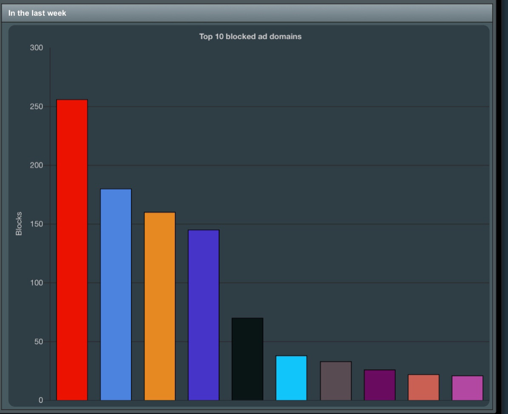
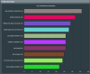
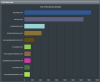
uiDivStats uiDivStats - WebUI for Diversion statistics

  • SNBForums Code of Conduct

    SNBForums is a community for everyone, no matter what their level of experience.

    Please be tolerant and patient of others, especially newcomers. We are all here to share and learn!

    The rules are simple: Be patient, be nice, be helpful or be gone!

I'm contemplating adding a legend back in - having the domains themselves as the label was cluttered though
A picture is worth a thousand words. Are you able to quickly try it out to see what the outcome is? Overall, a clean and uncluttered UI is always preferable imo.
 
2f338829e53836b04d3b077879aa576a.jpg


Loving the colours, they brightened my day


Sent from my iPad using Tapatalk
 
Love it. Can't believe how many Viber blocks there are on my network! Kids :(
 

Attachments

  • Screen Shot 2019-05-05 at 11.45.04 AM.png
    Screen Shot 2019-05-05 at 11.45.04 AM.png
    295.2 KB · Views: 305
Good choice, it looks great


Sent from my iPad using Tapatalk
 
This new version with the different resource is great. I tend to like the vertical better, seems more efficient use of space in my case. One thing, I am old, cranky, poor eyesight, and the new clown colors are overwhelming for me, I prefer more subtle colors. All my computers, phones, router, all have dark backgrounds with light text where possible.

I like this -
screenshot-router-asus-com-8443-2019-05-05-07-24-09.png


much better than this - is an option for full vs muted colors possible?
screenshot-router-asus-com-8443-2019-05-05-07-24-09.png
 

I'll add my insignificant opinion here too, I much prefer the original graphs. Very clean, elegant and understated.

The colors are not a problem with me, but the vertical bars would allow more data to be shown too while letting me concentrate on what I'm hovering over. :)

Seems like I'm in the minority, take it for what its worth. :)
I'm total agreement with you on this, vertical and info only in hover, like the first photo I added above.
 
This new version with the different resource is great. I tend to like the vertical better, seems more efficient use of space in my case. One thing, I am old, cranky, poor eyesight, and the new clown colors are overwhelming for me, I prefer more subtle colors. All my computers, phones, router, all have dark backgrounds with light text where possible.

I like this -
screenshot-router-asus-com-8443-2019-05-05-07-24-09.png


much better than this - is an option for full vs muted colors possible?
screenshot-router-asus-com-8443-2019-05-05-07-24-09.png

I agree with @Butterfly Bones. I think here the overall count and order level of each blocked domain is what truly matters than the color of each individual blocked domain. So having monochromal graphs does make sense.


However....if you really want to get technical with this and incorporate more than just one color [emoji6] and have the right tools to do so....you could tweak the color option based on total counts.

For example, all domain graphs maintain a blue color until count reaches, say 10K, then if it goes above that the color changes to, say green, or another hue that transitions nicely from the original one (no sharp contrast).

This would be particularly helpful not only when quickly glancing at the graphs but also for all those people who may not necessarily be interested in knowing what each category’s overall counts are in terms of numbers.


Sent from my iPhone using Tapatalk
 
I'll add my insignificant opinion here too, I much prefer the original graphs. Very clean, elegant and understated.

The colors are not a problem with me, but the vertical bars would allow more data to be shown too while letting me concentrate on what I'm hovering over. :)

Seems like I'm in the minority, take it for what its worth. :)
I'll admit i've been distracted:
upload_2019-5-5_16-11-56.png
 
I would argue that horizontal means more bars can be added, as the WebUI scales nicely vertically, not so much horizontally.

I'm still dabbling with colours, I'm leaning towards seeing if I can match the user's selected Diversion theme.

I would prefer the vertical bars to get skinnier. :)

Scrolling is so 1990's. :D
 
I've pushed an update that makes this layout used instead

GREAT layout ... oh ... and please don't drop the colourful horizontal bars with descriptions on the left ... "Yazzes";) up an otherwise mono-tone gui!
At best - provide a muted option for the non-colourists among us :D.

Leaping over to your donation page once again ... after properly enjoying the multiple added Yaz offerings - muchas gracias.
 

Latest threads

Sign Up For SNBForums Daily Digest

Get an update of what's new every day delivered to your mailbox. Sign up here!
Top